How have you improved your conventions of real media texts:
From our journey in A level media, we made a large improvement between our tasks of A1 and A2. We used the different elements of media to help make the improvements.
In AS media, we used very few pieces of soundtrack, which set a very pedestrian atmosphere. However for our A2 production, we used a variety of horror based soundtracks, with different tempos. This created a tense and dynamic atmosphere. We made to sure to time our soundtrack with the shots in the film. For example we used loud, fast tempo music in the scene where our protagonists are running away from our antagonist.
We also used our editing process to make further improvements to our A2 production. We used a variety of transitions to cut between the different scenes in our trailer, including fades to blacks and fast pace transitions.
Tuesday, 17 April 2018

Thursday, 29 March 2018


Wednesday, 21 March 2018
Filming Schedule
Our filming Schedule:
October Half Term
Monday 23rd - Meet in Fetcham at 11:30am
Create script for The Craze
Film scenes of the house
- Outside the house (establishing shot)
- Small scenes inside the house to show its family home (plants, family photos etc)
- Introduce brother and sister - watching TV or talking.
Tuesday 24th - Meet in Ashtead at 11:30am
Go to Ashtead Library to create wanted poster
Film scenes happening outside
- Water flowing along river
- Panning shot of the trees and the are being set
- Sean and Shannon throwing stones into river
- Shannon and Sean in park, notices wanted poster, picks it up
- Different way of seeing wanted poster, pinned on a lamppost
Wednesday, 7 March 2018
Ancillary Text Comparison
Ancillary Text Comparison:

There are several features of our film poster that makes it similar to that for the film poster of "IT." One of these is the colours that we have used throughout our poster. The colour code that we decided to use of black and white is conventional to the horror film posters. This is shown by the use of colours on the film poster for "IT." This shows that our film poster is similar to real life horror film productions.
Another feature of our film poster which is similar to the real life poster is the use of production credits. In both posters, you can see that the text has been placed at the bottom of the page. This is another example of how we have followed the conventions of real life ancillary texts
The final way in which I feel that we have followed examples of real life film posters is showing the characters that we have included in our production. This introduces our audience to the characters of our film, by allowing them to identify the protagonist and the antagonist.
We also created a film magazine cover as part of our production. I have made the comparison of this to a popular film magazine that is based around a horror movie.


One feature of our film's magazine which makes it seem believable to an audience is the use of a bold central magazine title. It is important for a film magazine to have a clear title that is central to the page, so it stands out to an audience. This will therefore entice the audience to buy the product. As well as this, a title of the film that is being promoted also needs to be placed on the magazine, to make sure that the audience knows which film is being advertised to them.
Another feature that we have included on our magazine that follows conventions is the use of smaller images that are included on the magazine, alongside the image that is central to the magazine. This allows the audience to be introduced further to some of the different features of the film.
Character Interview - Shannon
Character Interview - Shannon:
This video shows Shannon's interview for the role of her character. She was asked the same questions as the other group members.
Wednesday, 28 February 2018
Our Animated Storyboard
Animated Storyboard:
This is our Animated Storyboard. We edited this on IMovie, on an Iphone.
Tuesday, 27 February 2018


Post Production Editing:
Post Production Editing:
During the editing process of our film trailer, we used Adobe Premier Elements 15. In our production, we used many of the features that the programme had to offer to us.
One editing feature that we used in our trailer is transitions. An example of when we used this was the fast paced jump cuts that we included at the end of our production. This enhanced the tension that we had already created with the protagonists running away and the clown turning around to face the camera. This involved placing fades in between the two scenes.
Another feature of Adobe that we chose to apply to our trailer was lowering the volume of sound. We chose to lower the volume of some of the soundtrack that we used in our trailer, to make the dialogue stand out clearer to the audience. We also increased the volume for some of the soundtrack in our production. This was used to put fear into our audience, when they were watching some of the scenes towards the end of the production.
We also used the pan and zoom tool. This is shown when we close in on Hannah, the news reporter's, face. We made the choice to use this feature to show her serious facial expressions, so the audience can empathise with her. There is a second example of when we used this feature during the dialogue between the two protagonists. This allows the audience to empathise with their emotions.
During the editing process of our film trailer, we used Adobe Premier Elements 15. In our production, we used many of the features that the programme had to offer to us.
One editing feature that we used in our trailer is transitions. An example of when we used this was the fast paced jump cuts that we included at the end of our production. This enhanced the tension that we had already created with the protagonists running away and the clown turning around to face the camera. This involved placing fades in between the two scenes.
Another feature of Adobe that we chose to apply to our trailer was lowering the volume of sound. We chose to lower the volume of some of the soundtrack that we used in our trailer, to make the dialogue stand out clearer to the audience. We also increased the volume for some of the soundtrack in our production. This was used to put fear into our audience, when they were watching some of the scenes towards the end of the production.
We also used the pan and zoom tool. This is shown when we close in on Hannah, the news reporter's, face. We made the choice to use this feature to show her serious facial expressions, so the audience can empathise with her. There is a second example of when we used this feature during the dialogue between the two protagonists. This allows the audience to empathise with their emotions.
Monday, 26 February 2018
Director's Commentary
Director's Commentary of The Craze:
This is the director's commentary for the Craze trailer.
This is the director's commentary for the Craze trailer.
Saturday, 24 February 2018
Influences for our Production:
What were the influences of our production?

One of the influences of our film trailer was the antagonist from the film "IT", the clown Pennywise. We wanted the genre of our production to be horror, as well as making the sub-genre to be based around a clown. With the film being released recently, (2017) we felt that we would be able to match the character of Pennywise with our clown that we created. However, we still chose to slightly alter some of the features of our clown, mainly the appearance and personality.


One of our other influences that we had of our production is one of the locations that are shown in the film "Saw." We liked the way that the location is deserted and abandoned. We therefore felt that we could use this in our trailer, which we used towards the end of our trailer.


One of the influences of our film trailer was the antagonist from the film "IT", the clown Pennywise. We wanted the genre of our production to be horror, as well as making the sub-genre to be based around a clown. With the film being released recently, (2017) we felt that we would be able to match the character of Pennywise with our clown that we created. However, we still chose to slightly alter some of the features of our clown, mainly the appearance and personality.


Friday, 23 February 2018
Questionnaire for our Production
Audience Questionnaire for our Production:
We have created a questionnaire for our audience to fill out. The questions relate to our film trailer for "The Craze" as well as the film poster and magazine cover which we also designed.
1. Do you feel that our film trailer is conventional to the genre of horror?
Yes: No:
2. Do you feel that the protagonists of our production are represented as conventional horror film protagonists?
Yes: No:
3. What element of our trailer do you feel was successful?
4. What element of our trailer do you feel could have been improved?
5. Did the soundtrack create/add to a mood of fear and tension?
Yes: No:
6. Do our ancillary texts (film poster and magazine cover) look professionally designed?
Yes: No:
7. Does our film trailer, film poster and magazine cover encourage you to want to watch the full production?
Yes: No:
Thank you for taking the time to complete this questionnaire.
We have created a questionnaire for our audience to fill out. The questions relate to our film trailer for "The Craze" as well as the film poster and magazine cover which we also designed.
1. Do you feel that our film trailer is conventional to the genre of horror?
Yes: No:
2. Do you feel that the protagonists of our production are represented as conventional horror film protagonists?
Yes: No:
3. What element of our trailer do you feel was successful?
4. What element of our trailer do you feel could have been improved?
5. Did the soundtrack create/add to a mood of fear and tension?
Yes: No:
6. Do our ancillary texts (film poster and magazine cover) look professionally designed?
Yes: No:
7. Does our film trailer, film poster and magazine cover encourage you to want to watch the full production?
Yes: No:
Thank you for taking the time to complete this questionnaire.
Thursday, 22 February 2018
Codes and Conventions
Codes and Conventions:

One convention of the horror genre which we have shown on our film poster is the characters that are involved in horror movies. Our protagonist is portrayed as an innocent teenager, while the antagonist is shown as a ruthless, evil man.
Another horror film poster convention which we have shown is the colour coding. We predominantly used dark colours, such as black and grey top be the background for the poster. This is conventional to the genre as darker colours set the atmosphere of fear.


One convention of the horror genre which we have shown on our film poster is the characters that are involved in horror movies. Our protagonist is portrayed as an innocent teenager, while the antagonist is shown as a ruthless, evil man.
Another horror film poster convention which we have shown is the colour coding. We predominantly used dark colours, such as black and grey top be the background for the poster. This is conventional to the genre as darker colours set the atmosphere of fear.

As for our film magazine, one convention of a horror film ancillary text that we established is the image used. We used a close up of the clown's face as the main image of the magazine. We chose to use this to make it seem as if the audience are interacting with the antagonist, which creates a dark mood. We exploited this further by using direct mode of address, by having the clown staring at the camera, as if he was looking at the audience.
We also used similar colour coding to our film poster, by primarily using the colour black. However, another colour that we decided to use was the colour red. Red connotes blood and violence, which can hint to our audience that this is an element to our film.
Wednesday, 21 February 2018

How we made our trailer seem like a trailer
How have we our trailer seem like a trailer?
 This medium shot introduces the trailer and establishes the opening scene to the audience. It is conventional for a horror film by showing the location in a state of equilibrium.
 This two shot of our film's protagonists is used to introduce them to our audience. Having them throwing stones into a stream highlight their innocence.
 This medium shot acts as an establishment shot of one of the primary locations from our film. A family home conforms to the conventions of a horror film.
 This part of the trailer introduces the audience to the news report. This disrupts the equilibrium, which changes the mood and atmosphere of the trailer.
 This is one of several title shots that we have used in our film. This makes our trailer feel like a trailer as all trailers include title scenes. This shot shows the audience the slogan of our film, which is a way of promoting.
 This long shot introduces the antagonist of our production to our audience. We used direct mode of address by making him stare straight at the camera, as if he is looking into the eyes of the audience.
 This still image shows another two shot of the protagonists. In this part of the scene, they are running away to safety, upon encountering the antagonist. This would make the audience empathise with the characters.
 Here we have a medium shot of the antagonist. We feel that this shot is very effective, as it highlights the menacing facial expression of the clown. This will create more fear for the audience, as again the antagonist is staring directly at the audience.
 This two shot is key to our film trailer as it is the only scene in which one of the protagonists has encountered the antagonist. This is a prime example of the recognition stage in the narrative of our film. Shannon's facial expressions highlights the fear that she is feeling after meeting the clown.

Here we have another example of a title scene that we have included in our film trailer. This is conventional to all film trailers of all genres, as they are the production credits to our movie.


Here we have another example of a title scene that we have included in our film trailer. This is conventional to all film trailers of all genres, as they are the production credits to our movie.
Tuesday, 20 February 2018
Brand Identity
How is Brand Identity used?

One way in which we have created a brand identity is through our film's title. We chose to create the title by using a specific font. This would make it recognisable to our audience, creating a brand name. It also helps promote our production to a wider audience.

Another way in which we can gain a brand identity for our production is through slogans. Our slogan that is printed on our film poster is "BEHIND THE MASK REVEALS A STORY." The slogan entices audiences to want to watch our film, as they would like to see who is behind "the mask." We also included the slogan within our film trailer, to reach out to a further audience of our film.

One way in which we have created a brand identity is through our film's title. We chose to create the title by using a specific font. This would make it recognisable to our audience, creating a brand name. It also helps promote our production to a wider audience.

Another way in which we can gain a brand identity for our production is through slogans. Our slogan that is printed on our film poster is "BEHIND THE MASK REVEALS A STORY." The slogan entices audiences to want to watch our film, as they would like to see who is behind "the mask." We also included the slogan within our film trailer, to reach out to a further audience of our film.
Narrative
How is our narrative established in our trailer and ancillary texts?
One way in which our narrative was established was through Todorov's theory.
We showed the equilibrium of the narrative by introducing the protagonists and locations of our movie. This shows the original setting of the film, where all is normal. This is conventional to horror movies, as it hints to the audience that everything is how it is expected to be.
We then showed that there has been a disruption to the equilibrium. We chose to show this by including a news report based on a recent attack by a clown. The disruption is used to change the mood of the film by making the audience feel uncertain about what will happen later on in the film.
Following on from this, we showed the next stage of Todorov's narrative theory - the recognition of the disruption. This was shown in our trailer soon after the disruption. We showed a scene of the protagonists watching the news report on the clown. As the audience empathise with the protagonists of a film, they will now share the fear and worry that they are feeling, after the recognition of the clown attacks.
Due to it being a trailer, we chose not to show the final two stages of Todorov's narrative theory - the attempted repair of the damage and disruption and the return to the equilibrium. We feel that showing these stages would reveal too much of our film's plot.
Our ancillary texts help sell our product with our film trailer as they introduce our audience to the main characters and background storyline of our production.
One way in which our narrative was established was through Todorov's theory.
We showed the equilibrium of the narrative by introducing the protagonists and locations of our movie. This shows the original setting of the film, where all is normal. This is conventional to horror movies, as it hints to the audience that everything is how it is expected to be.
We then showed that there has been a disruption to the equilibrium. We chose to show this by including a news report based on a recent attack by a clown. The disruption is used to change the mood of the film by making the audience feel uncertain about what will happen later on in the film.
Following on from this, we showed the next stage of Todorov's narrative theory - the recognition of the disruption. This was shown in our trailer soon after the disruption. We showed a scene of the protagonists watching the news report on the clown. As the audience empathise with the protagonists of a film, they will now share the fear and worry that they are feeling, after the recognition of the clown attacks.
Due to it being a trailer, we chose not to show the final two stages of Todorov's narrative theory - the attempted repair of the damage and disruption and the return to the equilibrium. We feel that showing these stages would reveal too much of our film's plot.
Our ancillary texts help sell our product with our film trailer as they introduce our audience to the main characters and background storyline of our production.
Saturday, 17 February 2018
Insitution Companies
Institution Companies:
For our film, I feel that a production company such as Paramount Pictures would have made our film. I have completed research into the history of Paramount, which also involved finding out the successful films in which they have made. My research found several movies from the horror in which they have made, which is why I feel they would have been an institution who could have made our film.

Our two institutions that we made to create our film are "Asylum Productions" and "Woodland Films."
We created the logo for Asylum Productions by placing the image on a white background, above bold black text. We thought that this simple design would work best. For the logo of Woodland Films, we edited the original image, by lowering the lighting of the picture. This effect helped set a horror-based mood.
To follow conventions, we placed the production titles near the opening of our trailer, in between the opening scenes.


Thursday, 8 February 2018
Use of Titles

 Use of Titles
There are several different types of titles that we have used throughout our film trailer.
An example of a title that we used is our two titles for production companies. Our first of these is "Asylum Productions." The design of this title shows an old fashioned video camera placed on a tripod. The theme of the black and white colours show contrasting connotations. The colour black connotes mystery and fear, while the colour white connotes innocence, which could show the juxtaposition between the protagonists and antagonist of our film.
The other production company title that we chose to use is "Woodland Films" For the design, we placed white text over a abandoned forest in the dark. To enhance the effect of the dark, we lowered the lighting of the original picture, to set a gloomy mood. The theme of dark locations is conventional to horror movies.

The next type of title that we have included in our film is our production credits, which appear at the end of our trailer. We followed the conventional design of production credits in a film trailer, by having the small white text against a black background. As well as this, we have placed the release date of our film in large, bold text at the bottom of the screen. This is informative to our audience, as it tells us when they can expect to see our film.
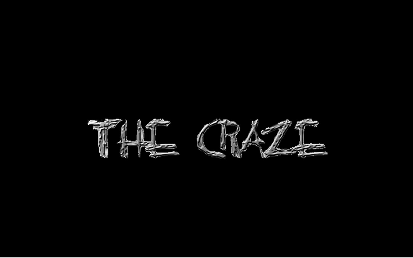
The other type of title that we have used in our trailer is the title of our film. This appears on the screen towards the end of our trailer. We chose to create our own text design, in which we used the website "https://cooltext.com/." We wanted to use text which linked to the genre of horror, so we chose a sinister style of text to achieve this.
Subscribe to:
Posts (Atom)