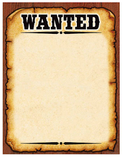
After looking at several different designs, this is our final choice of wanted poster outline. We like the simple style of the template, as well as the bold text at the top of the page, which stands out clearly. We feel that this is an improvement to the poster design that we originally looked at, due to it being more suitable for a horror film based in the UK, whereas the other design seemed more suited to an action-adventure film.
We then imported the picture of the antagonist and placed it onto the template, creating the overall poster as a prop for our film trailer. Overall, we feel that the features of this poster make it a useful and realistic prop to use in our horror film trailer.

Thank you because you have been willing to share information with us. we will always appreciate all you have done here because I know you are very concerned with our. poster display stands
ReplyDelete